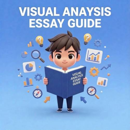
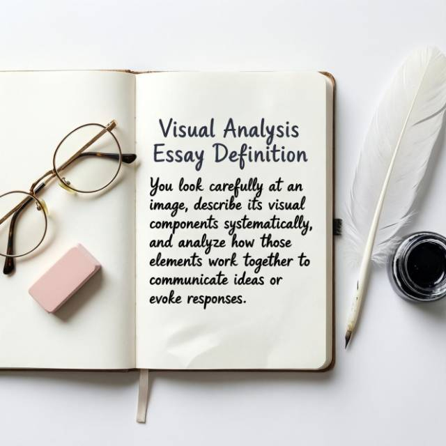
What Is a Visual Analysis Essay?
A visual analysis essay is a detailed examination of a visual text artwork, photograph, advertisement, film, or design where you describe what you see and explain how visual elements create meaning or effect.
The Three Essential Components
Description:
What you literally see in the image (objective observation)
Analysis:
How visual elements function and relate to each other
Interpretation:
What the image communicates or how it affects viewers
What Makes a Good Visual Analysis Essay?
Strong visual analysis essays share these qualities:
- Systematic observation: Examines all relevant visual elements, not just obvious ones
- Specific details: Points to exact colors, lines, compositions, not vague impressions
- Clear organization: Moves logically through visual elements
- Evidence based: Every claim connects to observable features
- Objective tone: Analyzes what's there, not personal taste
Bad visual analysis: Good visual analysis: See the difference? Specific, analytical, evidence based. |
Why Write Visual Analysis Essays?
- For art history: Learn to read and interpret visual culture critically
- For media studies: Understand how images persuade and communicate
- For design: Develop systematic observation skills
- For communication: Analyze visual rhetoric in advertising and media
- For critical thinking: Practice evidencebased interpretation
Visual literacy matters we encounter hundreds of designed images daily, and analysis helps us understand how they shape meaning.
From Outline to A+ Essay
Our writers deliver polished essays researched, structured, and ready to submit.
- 100% human-written
- Delivered on time, every time
- Unlimited revisions
- Based on YOUR experiences
Send your outline. We'll turn it into a finished essay.
Get Started NowHow to Analyze Visual Elements
Before writing, systematically examine these key elements.
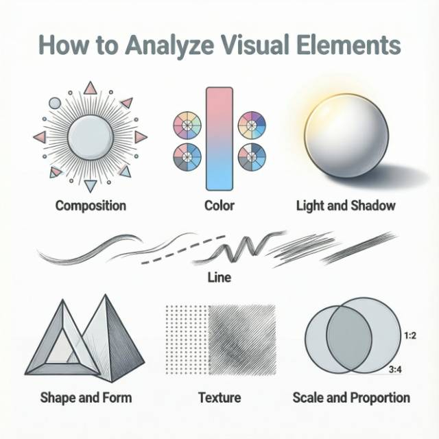
1. Composition
What to observe:
- Focal point: Where does your eye go first? What draws attention?
- Balance: Is the image symmetrical or asymmetrical? How is visual weight distributed?
- Rule of thirds: Are important elements positioned at intersection points?
- Framing: What's included? What's excluded? Where are edges?
- Depth: Is there foreground, middle ground, background? How is space created?
Questions to ask:
- How is the image organized spatially?
- What guides the viewer's eye through the image?
- How does composition emphasize certain elements?
2. Color
What to observe:
- Palette: What colors are present? Warm or cool? Saturated or muted?
- Contrast: High contrast (dramatic) or low contrast (subtle)?
- Color relationships: Complementary? Analogous? Monochromatic?
- Symbolic associations: Cultural meanings of specific colors
Questions to ask:
- How does color create mood or emotion?
- What do color choices communicate culturally?
- How does color direct attention?
3. Light and Shadow
What to observe:
- Light source: Where is light coming from? Single or multiple sources?
- Shadows: Hard or soft? Where do they fall?
- Contrast: Chiaroscuro (dramatic light/dark)? Flat lighting?
- Mood: How does lighting affect atmosphere?
Questions to ask:
- How does lighting create depth or dimension?
- What mood does the lighting establish?
- What's emphasized by light? What's hidden in shadow?
4. Line
What to observe:
- Types: Straight, curved, diagonal, horizontal, vertical
- Quality: Thick or thin? Sharp or soft? Continuous or broken?
- Direction: Where do lines lead the eye?
- Implied lines: Lines created by arrangement of elements, not actual drawn lines
Questions to ask:
- How do lines create movement or direction?
- What do different line types suggest (verticals = stability, diagonals = tension)?
- How do lines organize the composition?
5. Shape and Form
What to observe:
- Shapes: Geometric or organic? Regular or irregular?
- Forms: Three dimensional or flat?
- Positive/negative space: Objects vs. empty space
- Repetition: Repeated shapes creating patterns or rhythm
Questions to ask:
- What shapes dominate the image?
- How do shapes relate to each other?
- How does positive/negative space balance work?
6. Texture
What to observe:
- Actual texture: Physical surface texture (in sculptures, prints)
- Implied texture: Visual representation of texture (in paintings, photos)
- Smooth or rough: What does texture suggest?
Questions to ask:
- How is texture represented or suggested?
- What does texture contribute to meaning?
- How does texture affect the viewer's response?
7. Scale and Proportion
What to observe:
- Size relationships: What's large? What's small?
- Realistic proportions: Accurate or distorted?
- Emphasis: What does size emphasize or diminish?
Questions to ask:
- How does scale create hierarchy or importance?
- Are proportions realistic or deliberately altered?
- What does scale manipulation communicate?
How to Write a Visual Analysis Essay: Step by Step
Follow this 5 step process to craft an effective visual analysis.
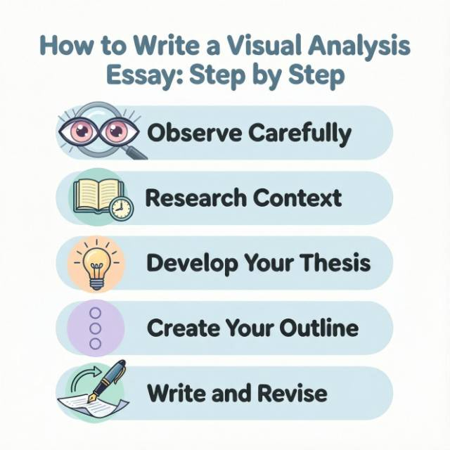
Step 1: Observe Carefully
Spend significant time looking before writing anything.
First viewing (5–10 minutes):
- What's your immediate impression?
- Where does your eye go first?
- What dominates the image?
Second viewing (10–15 minutes):
- Systematically examine each element (composition, color, line, etc.)
- Take notes on everything you observe
- Notice details you missed initially
Third viewing (5–10 minutes):
- Look for patterns and relationships between elements
- Consider how elements work together
- Note techniques or strategies used
Pro tip:
Don't look up information about the image yet. Form your own observations first.
Step 2: Research Context (When Appropriate)
After your initial observations, gather relevant background.
For artworks:
- Artist's background and other work
- Historical period and art movement
- Original context (where displayed, for whom)
- Medium and techniques used
For advertisements:
- Product and brand identity
- Target audience
- Publication context (where it appeared)
- Cultural moment (what was happening when it ran)
For photographs:
- Photographer's background and style
- Subject and context
- Technical information (if relevant)
Important:
Context informs but doesn't replace visual analysis. Your essay should focus on what's visible in the image.
Step 3: Develop Your Thesis
Your thesis should make an argument about how visual elements create meaning or effect.
Weak thesis (descriptive):
"This advertisement uses color, text, and images to sell a product."
Strong thesis (analytical):
"Apple's 1984 Super Bowl advertisement uses dystopian imagery, stark contrasts, and a single burst of color to position the Macintosh as revolutionary technology liberating users from conformity establishing a brand identity that persists today."
Thesis formula:
[Image] uses [specific visual elements] to [create effect/communicate meaning] for [audience/purpose].
Step 4: Create Your Outline
Organize analysis logically before writing.
Standard structure:
I. Introduction
Basic identification (title, artist/creator, date, medium)
Brief description of what's visible
Thesis statement
II. Body Paragraph 1: Composition
How image is organized
Focal points and visual hierarchy
What composition emphasizes
III. Body Paragraph 2: Color/Light
Palette and color relationships
How color creates mood or meaning
Light and shadow effects
IV. Body Paragraph 3: Other Key Elements
Line, shape, texture (as relevant)
How they support your thesis
V. Body Paragraph 4: Overall Effect
How elements work together
What the image communicates
Impact on viewer
VI. Conclusion
Restate thesis
Broader significance
Why this analysis matters
Step 5: Write and Revise
Complete your essay and revise it thoroughly. Follow the following Writing tips:
- Use the present tense:
"The painting uses" not "The painting used." - Be specific:
"The palette consists primarily of warm earth tones: ochre, burnt sienna, and raw umber." - Connect observations to meaning:
Don't just describe. Explain what visual choices accomplish. - Use evidence from the image:
Point to specific elements you're discussing. - Avoid personal opinion:
"The harmonious color palette creates visual unity"
Visual Analysis Structure
Introduction (10–15% of essay)
Purpose:
Identify the image and present your thesis.
What to include:
- Artist/creator name
- Title of work (in italics for artworks)
- Date created
- Medium (oil on canvas, photograph, digital advertisement, etc.)
- Brief description of what's visible (1–2 sentences)
- Your thesis
Body Paragraphs (70–75% of essay)
Organize by visual element, not by random observations.
Each paragraph should:
- Focus on one element or group of related elements
- Describe what you observe specifically
- Analyze how it functions
- Connect to your thesis
Conclusion (10–15% of essay)
Purpose:
Synthesize your analysis and explain significance.
What to include:
- Brief restatement of how visual elements work together
- Broader significance or implications
- Why this analysis matters
Struggling With Examples or Structure?
Our professional writers specialize in illustration essays that demonstrate concepts with strong, specific evidence.
- Zero plagiarism, 100% original
- Academic tone and detailed analysis
- Expert editing and formatting
- Confidential and reliable
Get a clear, example-driven essay that impresses your professor.
Order NowEssential Visual Terminology
Use precise terms when describing visual elements.
Composition Terms | Color Terms |
|
|
Line Terms | Light Terms |
|
|
Common Visual Analysis Essay Mistakes to Avoid
Mistake 1: Only Describing, Not Analyzing
The problem:
"The painting has blue and red colors. There's a person in the center. There are trees in the background."
Pure description without analysis of function or meaning.
The fix:
After describing, explain WHY and HOW.
"The painting positions the figure centrally against a blue sky, creating symmetrical balance that emphasizes stability. The red clothing contrasts dramatically with cool blue surroundings, drawing immediate attention to the figure and suggesting vitality against the calm landscape."
Mistake 2: Discussing Personal Feelings Instead of Visual Evidence
The problem:
"This painting makes me feel sad. I think the artist was depressed when they painted it."
Personal response without visual analysis.
The fix:
Connect emotional response to observable elements.
"The painting's muted, desaturated palette dominated by grays and blues creates a somber mood. Combined with the isolated figure positioned in the composition's lower third leaving vast empty space above the visual elements establish melancholy through formal choices rather than explicit subject matter."
Mistake 3: Writing Like a List
The problem:
"The painting uses color. It also uses line. Shape is used too. Texture is present."
Disconnected observations without flow or argument.
The fix:
Organize by how elements work together to support your thesis.
Mistake 4: No Thesis
The problem:
Your essay describes everything visible but makes no argument about meaning or effect.
The fix:
Develop a thesis about what the image accomplishes and how visual elements achieve it.
Mistake 5: Ignoring Context When Relevant
The problem:
Analyzing a 1950s advertisement with contemporary values, missing historical significance.
The fix:
Consider when and for whom the image was created while focusing primarily on visual elements.
Mistake 6: Over Interpreting Without Evidence
The problem:
"The red color represents the artist's anger at capitalism and society's failure to address inequality."
Claims not supported by visual evidence or context.
The fix:
Ground interpretations in observable features and documented context.
Mistake 7: Vague Language
The problem:
"The colors are good. The composition is interesting. The image is effective."
Generic terms that don't say anything meaningful.
The fix:
Use specific, precise language and explain what you mean.
Visual Analysis Example
Example1: Analysis of Hope Poster (Barack Obama, 2008)
Shepard Fairey's iconic "Hope" poster (2008, screen print) depicts Barack Obama gazing upward, rendered in simplified forms using only red, beige, and blue against a solid blue background. Through strategic use of limited color palette, upward gaze, and stylized graphic reduction, the poster creates a sense of idealistic aspiration and accessible heroism that proved remarkably effective for Obama's 2008 presidential campaign.
The poster's composition employs a low angle perspective, positioning viewers looking up at Obama. This upward angle traditionally conveys authority and heroism in visual culture we literally look up to the subject. Obama's gaze directs even further upward, toward something beyond the frame, suggesting vision and forward thinking rather than direct eye contact with viewers. This combination positions Obama as both accessible (facing viewers) and aspirational (looking toward a better future).
Color choices work on multiple levels simultaneously. The red, white (or beige), and blue palette obviously references the American flag, anchoring Obama the first Black president firmly within American iconographic tradition. However, the specific color application is more sophisticated: warm red tones highlight Obama's face, particularly around the eyes and upper features, drawing attention to his gaze and creating warmth. Cool blues recede into the background and shadows, establishing depth despite the image's flat graphic style. This warm/cool contrast makes Obama's face emerge from the composition while the muted, vintage tones (not bright primary colors) suggest both nostalgia and seriousness change grounded in tradition rather than radical departure from it.
The graphic simplification reducing photographic detail to three tones plus background serves strategic purposes beyond aesthetic choice. Simplified forms make the image instantly reproducible and recognizable, essential for grassroots campaign materials. The style deliberately references revolutionary propaganda posters (particularly Soviet and Chinese examples) while domesticating their associations through all American colors. This visual vocabulary suggests transformative change ("revolution") while the execution and context keep it safely within democratic tradition. The technique also creates visual accessibility anyone could theoretically reproduce this image, making Obama's campaign feel participatory rather than top down corporate.
The word "HOPE" functions as visual element as much as text. Positioned at the bottom in bold, sans-serif capital letters, it anchors the composition and provides explicit interpretation of Obama's upward gaze. The typography style bold, geometric, authoritative reinforces the poster's overall directness. Notably, "HOPE" doesn't describe Obama himself (not "LEADER" or "PRESIDENT") but rather names an emotion the image should evoke, cleverly making viewers' response part of the message.
These formal choices worked together to create one of the most effective political images in American history, appearing everywhere from official campaign materials to street art to gallery exhibitions. By analyzing how Fairey deploys color, composition, style, and text, we understand how visual elements create political meaning transforming a presidential candidate into an icon of aspirational change through purely visual means.
Example 2: Analysis of Guernica (Pablo Picasso, 1937)
Picasso’s monumental painting Guernica (1937, oil on canvas) depicts a chaotic scene of human and animal figures fractured by violence, rendered almost entirely in black, white, and gray. Through distorted forms, compressed composition, and stark monochromatic palette, the painting communicates the horror, suffering, and moral outrage caused by the bombing of the Spanish town of Guernica during the Spanish Civil War.
The composition is crowded and claustrophobic, forcing figures into a shallow, compressed space that denies visual relief. Bodies overlap, limbs intersect, and sharp triangular shapes slice through the scene, creating relentless visual tension. There is no clear focal point; instead, the viewer’s eye ricochets between screaming mouths, outstretched arms, and wounded animals. This lack of compositional stability mirrors the chaos and disorientation of violence, making the viewer experience confusion rather than observe it calmly.
Picasso’s use of black, white, and gray eliminates any sense of warmth or comfort. The absence of color strips the scene of beauty and instead recalls newspaper photographs, reinforcing the painting’s connection to real world events. Harsh contrasts between light and dark heighten emotional intensity: illuminated faces appear ghostly and exposed, while deep shadows swallow bodies and space. This stark tonal contrast amplifies the sense of death, grief, and moral starkness, leaving no room for ambiguity about the painting’s message.
Distortion and fragmentation function as expressive tools rather than stylistic experimentation. Figures are twisted unnaturally, mouths gape in silent screams, and eyes appear wide and unseeing. The bull and horse recurring symbols in Picasso’s work anchor the chaos while remaining ambiguous, allowing multiple interpretations without softening the overall condemnation of violence. The shattered forms visually echo the physical destruction caused by aerial bombing, turning human suffering into a fractured visual language.
Together, these visual elements transform Guernica into a universal statement against war rather than a literal historical illustration. By rejecting realism and embracing symbolic distortion, Picasso conveys emotional truth more powerfully than factual representation could. The painting’s enduring impact lies in how its formal choices composition, color, and abstraction translate political atrocity into a timeless visual indictment of violence and human suffering.
100+ Visual Analysis Essay Topics
Here's a comprehensive list of 100+ topics, organized by category and suitable for both college and high school students.
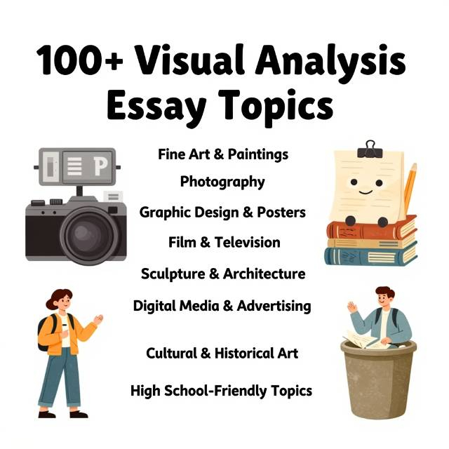
I. Fine Art & Paintings (Classical and Modern)
- Leonardo da Vinci’s Mona Lisa
- Michelangelo’s The Creation of Adam
- Vincent van Gogh’s Starry Night
- Edvard Munch’s The Scream
- Pablo Picasso’s Guernica
- Frida Kahlo’s The Two Fridas
- Salvador Dalí’s The Persistence of Memory
- Johannes Vermeer’s Girl with a Pearl Earring
- Claude Monet’s Water Lilies
- Georgia O’Keeffe’s Red Canna
- Grant Wood’s American Gothic
- Caravaggio’s The Calling of Saint Matthew
- Henri Matisse’s The Dance
- Jackson Pollock’s Number 1A
- René Magritte’s The Son of Man
- Diego Rivera’s Man at the Crossroads
- Edouard Manet’s Olympia
- Katsushika Hokusai’s The Great Wave off Kanagawa
- Paul Cézanne’s Mont Sainte-Victoire
- Pierre-Auguste Renoir’s Dance at Le Moulin de la Galette
II. Photography
- Dorothea Lange’s Migrant Mother
- Ansel Adams’ Moonrise, Hernandez, New Mexico
- Henri Cartier-Bresson’s Behind the Gare Saint-Lazare
- Robert Capa’s D-Day Landing
- Cindy Sherman’s Untitled Film Stills
- Steve McCurry’s Afghan Girl
- Dorothea Lange’s White Angel Breadline
- Annie Leibovitz’s celebrity portraits
- Sebastião Salgado’s Workers Series
- Lewis Hine’s child labor photographs
- Margaret Bourke-White’s Fort Peck Dam
- Joe Rosenthal’s Raising the Flag on Iwo Jima
- Alfred Stieglitz’s The Steerage
- Man Ray’s Le Violon d’Ingres
- Dorothea Lange’s White Angel Breadline
III. Graphic Design & Posters
- Shepard Fairey’s HOPE poster (Obama 2008)
- Vintage WWII propaganda posters
- Coca Cola advertisements (classic or modern)
- Nike “Just Do It” campaigns
- Apple product advertisements
- Movie posters: Jaws, The Godfather
- Political campaign posters in general
- Public service announcement posters (anti smoking, COVID-19)
- Modern minimalist logos: Google, Airbnb, Starbucks
- Film festival posters
IV. Film & Television
- Opening scene of Citizen Kane
- Lighting in Blade Runner (1982)
- Color symbolism in Schindler’s List
- Costume design in The Great Gatsby (2013)
- Set design in The Lord of the Rings
- Cinematography in Inception
- Use of shadows in Nosferatu (1922)
- Framing in Alfred Hitchcock’s Psycho
- Montage in The Godfather
- Symbolism in Black Panther
- Costume and color in Mad Men
V. Sculpture & Architecture
- Michelangelo’s David
- Auguste Rodin’s The Thinker
- Bernini’s Ecstasy of Saint Teresa
- The Parthenon, Athens
- Guggenheim Museum, New York (Frank Lloyd Wright)
- Fallingwater House (Frank Lloyd Wright)
- The Eiffel Tower, Paris
- Sydney Opera House, Australia
- Sagrada Familia, Barcelona
- Statue of Liberty, New York
- Mount Rushmore, USA
- Cloud Gate (“The Bean”), Chicago
VI. Digital Media & Advertising
- Instagram influencer campaigns
- TikTok branded content
- Web banner advertisements
- Memes as visual communication
- YouTube thumbnails
- Social media infographics
- Online political ads
- Animated GIFs as storytelling
- Brand packaging design (Cereal, Beverages)
- Spotify album covers
VII. Cultural & Historical Art
- African masks and ceremonial art
- Indigenous Australian dot paintings
- Ancient Egyptian wall art
- Roman mosaics
- Native American ledger art
- Islamic geometric patterns
- Japanese ukiyo-e prints
- Medieval illuminated manuscripts
- Mayan murals
- Renaissance frescoes
- Baroque altarpieces
- Gothic cathedral stained glass
VIII. High School Friendly Topics
- Your school’s yearbook cover design
- School sports team logo
- Local street murals
- Movie poster for a recent film
- Album cover of a favorite band
- Political campaign flyers in your area
- Social media profile layout as visual communication
- Advertising campaigns from favorite brands
- Packaging design for snacks or beverages
- Film scenes from animated movies
- Photography of local events or festivals
- Local public service announcement posters
IX. Comparative Topics
- Compare two political posters (different elections)
- Compare Renaissance vs. Baroque paintings
- Compare two versions of Mona Lisa reproductions
- Compare color use in Monet vs. Van Gogh
- Compare film posters from different decades
- Compare commercial vs. fine art photography
- Compare sculptures from different cultures
- Compare digital media campaigns of two brands
Topic Selected? Don't know how to proceed?
Tell us what you need, our experts will handle the research, writing, and formatting.
- Original work with zero plagiarism
- Fast turnaround
- Expert writers across all subjects
- Free AI and plagiarism reports
No AI shortcuts. Just expert-level quality.
Order NowConclusion: Key Takeaways
- A visual analysis essay goes beyond description by explaining how visual elements create meaning or effect.
- Effective analysis is systematic, examining composition, color, light, line, shape, texture, and scale rather than making scattered observations.
- Strong essays are evidence based, grounding every claim in clearly observable features of the image.
- A clear thesis guides the analysis and connects individual visual elements to an overall argument.
- Organization matters: structure body paragraphs by visual elements and their function, not by personal reaction.
- Context can deepen understanding, but the focus should remain on what is visible in the image itself.
- Precise terminology and specific language strengthen credibility and clarity.
Mastering these principles helps you move from simply seeing images to critically understanding how they communicate ideas, emotions, and values.